Posts

The Blues

Image
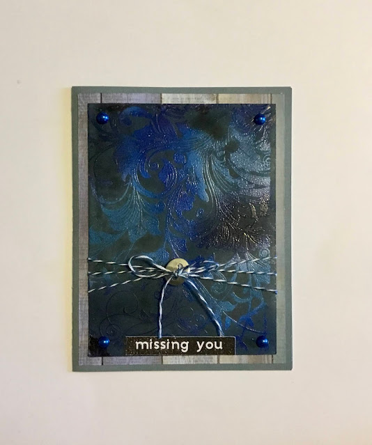
Tic-tac-toe challenges are so much fun!  For the  Creative Confetti: Tic Tac Toe Challenge I chose a diagonal row with: use a background stamp, use the color blue, and use twine. Since I had just made a card using the Jacob’s Coat technique, which is just a variation of the Trapped Emboss Resist technique, and had been thinking about how pretty is would be to make a more monochromatic version, I had my idea. I’m sending this to my dad, so I’ll also be entering it in the Sugar Pea Designs September Meant To Be Sent challenge. On the bottom layer I used Catherine Pooler Stone Blue, Suede Shoes, and Juniper Mist ink. I then stamped over it with my Inkadinkadoo Flourish stamp using Versamark, and embossed it with Nuvo clear fine detail powder. Using a sponge roller, I covered it with Black Jack ink and buffed the excess off the embossed portions with a paper towel. I wrapped blue twine around it 3 times and tied it together in front with a steel button. Next I added 4 blue pear...

Golden Globe

Image
This card was created for the  DRU Challenge #153 - One For The Boys . In my opinion, masculine card ideas are always more difficult to find than feminine cards, that’s one reason I purchased the Stampin Up Beautiful World Bundle. I also stuck to neutral colors. Using black cardstock, I cut a card base, a 2 3/8” x 5” mat, and 2 die cut Happy Birthdays. Then with metallic gold I cut a 2 5/8” x 5 1/4” mat, a die cut Happy Birthday, and a die cut lace strip.  Using a piece of pale greenish-blue wave print scrap of paper, I stamped a globe with MFT Extreme Black. I cut it out using the circle die from the set, and cut the stand with the die on white cardstock. Next, I used a black Ranger embossing pen to color the continents on the globe, & embossed them with Stampendous fine detail black embossing powder. I embossed the stand using using 2 layers of Versamark and Lindy’s Stamp Gang Groovy Granite. The small piece of black cardstock I embossed with the compass from the set us...

Autumn Kitty

Image
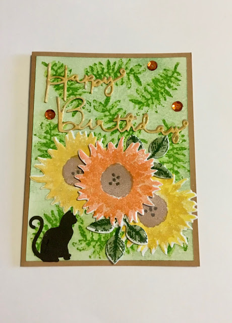
A few challenges have come up using similar colors:  Creative Confetti - Colors of Fall! ; The House That Stamps Built - Inspiration Palette Challenge ; & the MFT Color Challenge 150 . Woo hoo! One card, three entries. So here’s what I came up with. The Painted Harvest stamp & die set from Stampin Up is retired, but I found a used set on ebay for a good price, so what better to use for these colors?   For the background I applied a light layer of Catherine Pooler Garden Party to white cardstock, spritzed it with water, & dried it quickly with my heat gun. Next I stamped the 2 layer fern-type leaf in Melon Ice & Lime Rickey, then attached it to a Kraft card base. On another piece of white cardstock I stamped 2 of the leaf sets with Sage & Spruce, one flower with Limoncello & Shea Butter, one with Shea Butter & Tiara, and one with Bellini & Orange Peel. For the centers I used Sahara Sand and Memento Espresso Truffle. I then cut them all using the...

Rainbow Paisley

Image
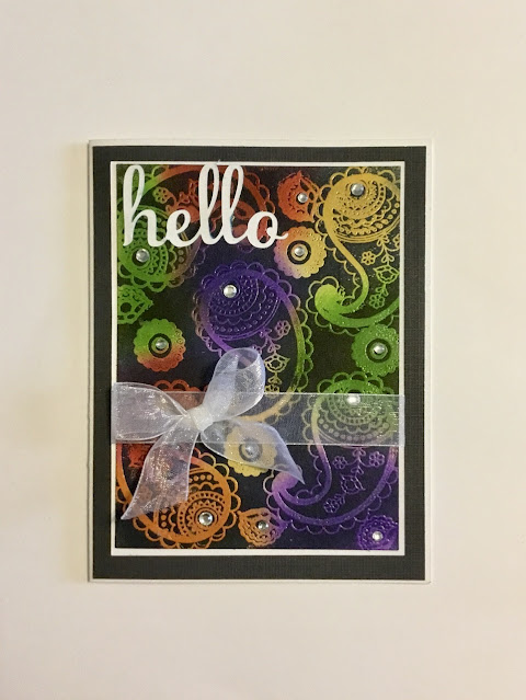
 I’m not good at rainbow color cards. I always seem to have difficulty getting the combinations to look harmonious. So here is another try - a rainbow color card for the  Pinkfresh Studio September Challenge: Rainbow . As I was skimming ideas I saw this “ Jacob’s Coat Technique ” card by Dawn Griffin and thought I’d give it a shot. The colors I used underneath were green, yellow, orange, red, & violet. I used a navy blue on top & for the bottom mat. Then I added some clear rhinestones, a sheer white ribbon, & a white cardstock “hello”. That’s it!  I do like this technique, I’ll probably try it again with fewer colors & a different stamp. Wouldn’t it also look pretty done with different shades of the same color? Maybe shades of blue using my big flourish stamp? Thanks for stopping by! Sandy

Steampunk Owl

Image
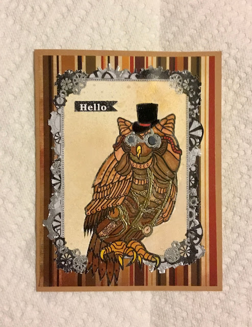
Steampunk can be so much fun, so I was excited when Simon Says made it this Monday’s challenge theme!  I’ve used a streampunk heart before, for my dad’s birthday card, so I figured I’d try something different this time.  I didn’t have any appropriate stamps or dies, so I went online to Etsy and found a couple of graphics that I liked. Cricut Design Space has an application called “Print then Cut” that is mainly meant for ink jet printing in color on vinyl, but I’ve been experimenting with using it with a laser printer to create the inside verses for greeting cards and decided to give it a shot for the front graphics too. Upon finding a free steampunk frame online I imported it, along with the graphics I purchased, into Design Space.  It turned out to be very difficult to get the image to print nice & sharp. I think I can do it eventually but after spending 2 evenings I put it aside for now and ended up using the Adobe Photoshop Mix app and printing it from my photo f...

More Poppies!

Image
I do love poppies: in real life, stamped, die cut... so it wasn’t a tough decision to pull out my Poppy Moments dies again when I saw the colors chosen for the MFT Color Challenge 149 :  Jellybean Green, Natural, Coral Crush, and Tangy Orange. I also made this card so I could enter it in the Simon Says Monday Challenge: Frame It .  I used orange, coral, and white paper to cut out the poppies and then added some shading using some finger daubers and Catherine Pooler ink in Bellini and Orange Peel.  I cut the leaves in 2 shades of green and used CP Sage ink on the top layer. The centers were cut in black cardstock. For the frame, I used tan/natural linen cardstock, and used 2 sizes of stitched rectangular dies to cut 2 frames. This also left me with 2 smaller stitched mats. From the same sheet I made a card blank using my Cricut Maker.  Doing it again, I would have just cut the frames using my Maker as well, since the stitching  created difficulty when it came t...

Lavinia Gold Ferns

Image
 The theme for the Lavinia World Challenge #35 was anything goes. Using a Lavinia stamp wasn’t a requirement but I happen to LOVE Lavinia stamps and am trying to increase my collection. I used the fiddlehead fern stamp embossed in gold.  The background is one of the ones I made using the mica spray, Brusho, & Saran Wrap technique by Eileen Godwin . This time using gold mica spray & black Brushos. It came out looking more navy blue than black, so I used a navy card blank, added a white mat, gold ribbon, & Happy Birthday sentiment. The gold in the background really shimmers too. Fun, yes? Thanks for stopping by! Sandy